I was going to just project/write words onto someone's face, but I found it way too common on the internet so I wouldn't feel like it was my own. I was inspired by Rankin to overlay pictures on someone's face instead, just like he had with a film strip over Robert Downey Junior. To start off with I did a photo shoot of some images I took in the studio of some magazine covers that are influencing diets, skinny models or fitness.
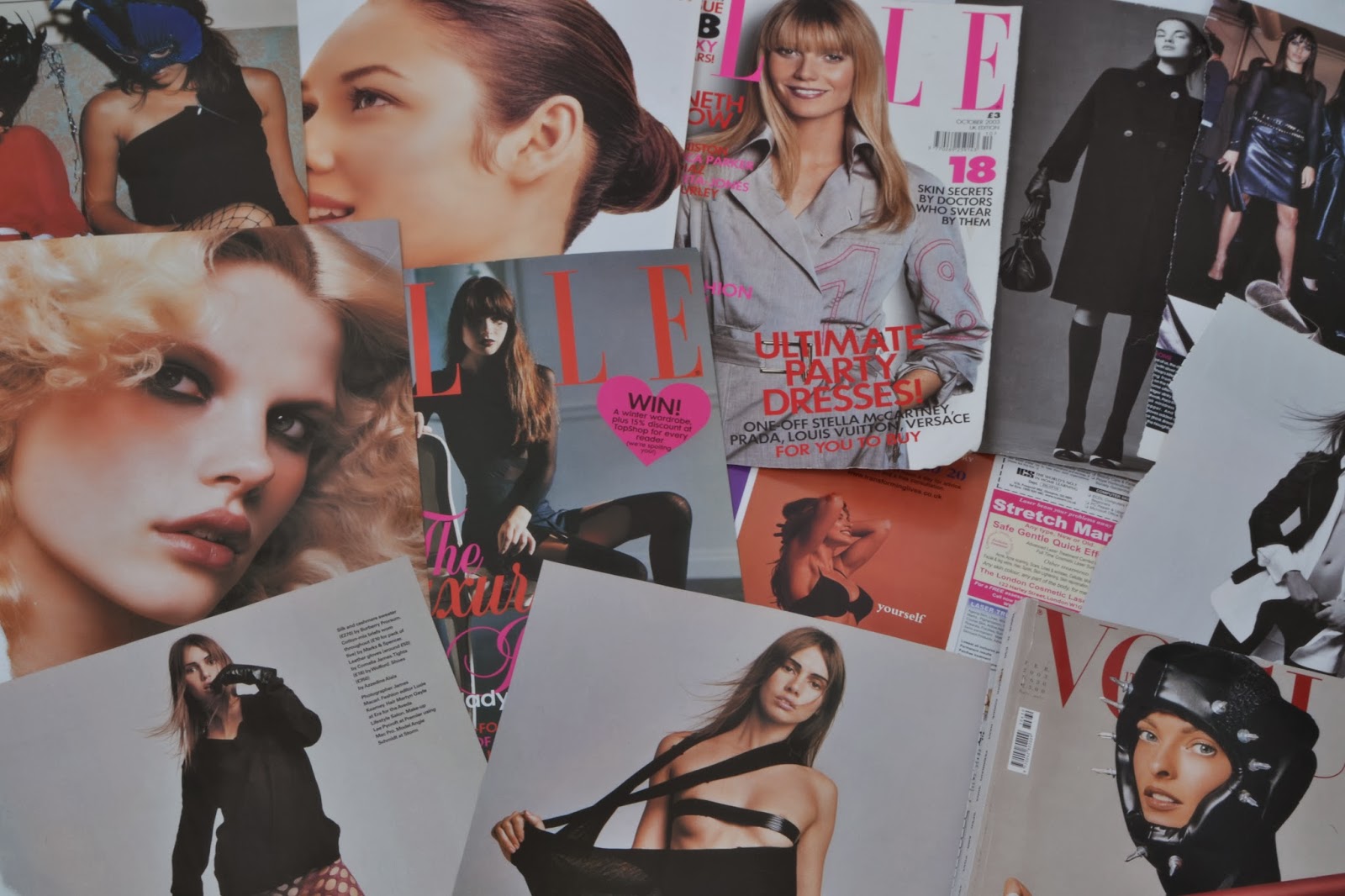
 The first image is showing various newspaper articles of women which I took to represent how some people believe that the media influences being skinny or fit by showing these kinds of photos of women.
 Your eye leads towards the middle because I feel like lines of the newspapers overlapping causes your eyes to be guided to the middle so you can then look around the image from there. There isn't really a composition, although the newspapers are cut off the page, but that was purposely done to make it seem like there are loads of them covering the floor.
I used an aperture of F/13 and a shutter speed of 1/200 sec because I wanted a narrow depth of field to capture all the detail of the newspapers, and there was a lot of light from the studio so the shutter speed didn't need to allow too much light through.
There are a variety of colours of black, grey, white, nude, blonde and red. There isn't any high contrast apart from the red hair from the top right model.
I feel this image creates the mood of confidence. Although most people would say they're vulnerable from being in the nude, I congratulate them on being confident enough to expose themselves on something millions of people read in a world where judgement happens all the time. This mood will be useful for when I overlap it onto a portrait because it will represent how girls look up to these brave women.
The only textures in this image is the paper feel of the newspapers. This is so it creates a smooth effect when overlapped on the portrait later on.
To improve this image, I would use Photoshop to brighten the contrast as it looks quite dull. I would also cut out the models better because I feel there is irrelevant articles on there.
 The second image shows the magazines at a different angle so I was able to include more newspaper articles.
Your eye leads towards the middle again due to the leading lines caused from the overlapping of newspapers. This is useful for guiding the viewer's eye along the articles.
I used an aperture of F/20 and a shutter speed of 1/80 sec because I needed the depth of field to be narrow to capture the detail, and there was a lot of light from the studio so I didn't need the shutter speed to allow too much light through.
The colours are the same as the previous one with colours black, white, nude, blonde, brunette and red. There is no high contrasts due to the dull lighting.
The mood is also the same (confidence) as well as the textures (paper-like).
To improve this image, I would brighten the contrast on Photoshop as this image is also dull, and I would also change the layout so the creases on some articles don't show. The bottom right image is also distracting because you can't see the whole body.

Your eye leads top left corner due to the closeness of the models in that area. It creates a rule of three in the top left due to the images being so close up.
I used an aperture of F/18 and a shutter speed of 1/80 sec. This is because I wanted a narrow depth of field to capture all the detail as well as not allowing too much light from the studio to get through.
There are more colours in this image from the magazine covers so we have the colours blonde, brunette, black, orange and pink. The highest contrasts come from the pink and orange due to them standing out from the duller colours of black and grey.
This image creates the mood of dominance. These women are in strong poses showing how confident they are, as well as having close ups which make the vulnerable to being judged. This is great for my project as it represents how other people will look up to these kind of women.
The textures are the same as the newspapers having a paper feel to it as well as smoothness from the glossy magazines.
To improve this image, I would brighten it using Photoshop as it is quite dull, and would also change the composition as I feel the space in the top right causes a distraction.
This image is similar to the previous one although I changed the composition so the white space at the top right was removed.
Your eye still leads the the top left as that is where most of the bright colours are so it catches your eye.
I kept the aperture the same using F/18 and also the shutter speed of 1/80 sec. This is for the same reasons of not needing too much light getting in and having a narrow depth of field to capture the detail.
The colours are the same with black, blonde, brunette, orange and pink; with only the bright colours having a high contrast.
The mood still shows dominance and the textures are still paper-like.
To improve this image I would brighten it with the help from Photoshop as it looks dull. In this image the white spaces are removed so this isn't a problem now.
Now this photo shoot is done, I will need the help of a model to take portrait photos so I can develop this photo shoot further by overlapping them on the portraits. This will represent the idea of the media affecting how we think.
 I wanted my model to have a straight face because I felt a happy face would be disrespectful to those who actually feel the way they do about their body. I left the composition in the middle so all the attention is on her to show she is the main focus. The dark make-up was to attract the attention to her face as the bright lipstick attracts your eye, and it also shows how she feels she must wear make up to look pretty.
The techniques I used were an aperture of F/5.6 and a shutter speed of 1/8 sec. This is because the lighting was bright so I didn't need to allow too much light in.
The colours include brown, blonde, nude, red and black, which are all harsh colours to set the scene of a serious situation.
The textures include the soft fabric of her shirt, face and hair which helps create an innocence to her.
The mood I get from this image is vulnerability; she doesn't look happy at the fact she's exposed to the camera so closely.
Even though she has a gap in her fringe, I wouldn't want to remove it because it just shows one imperfection that we can all see. I don't want her to look 'perfect' because it defeats the purpose.
 This next image shows the girl at a portrait position to experiment with the different angles. I kept the facial expression the same for the same reasons as before. The composition is still in the middle due to it being a portrait, which will allow me to layer the other photos onto her better.
I used an aperture of F/5.6 and a shutter speed of 1/8 sec because there was a lot of light that I didn't need to let through the lens. I didn't want the picture to be too bright because I know my other photos were dark.
The colours and textures are the same as before, and I still wouldn't make any changes.
My next aim for this development is to overlay the magazine photos over her face or around her. This is to represent how media can affect society, as said before. I did this by going onto Photoshop, choosing a portrait and magazine/page 3 photo and looking through the blending layers options. Below are the results.

Darken

Overlay

Overlay

Overlay
Overall I am really happy with the outcome of the Photoshop blending methods. I feel it layers really well as you can clearly see both layers, and the darkened areas really help show the detail.
No comments:
Post a Comment