What is Landscape Photography?
To me, landscape photography is an image of scenery that has a hidden meaning to it. I believe that no people should really be in landscape photography as it's distracting from the main object; the scenery. They "typically capture the presence of nature but can also focus on man-made features or disturbances of landscapes." (http://en.wikipedia.org/wiki/Landscape_photography)How does it work?
Landscape photography involves actually going out to find some landscapes. For some photographers, they go and travel the world to find beautiful sceneries to take photos of. It's the perfect way of showing people how other parts of the world look like, as we can't go everywhere in the world.
Professional landscape photographers usually use manual settings on their camera to get the natural beauty of the landscape, so they would spend time choosing the scenery and the settings they needed to use on their camera before taking the photo.
Nowadays we have the technology to edit the photos to make certain parts stand out. For example, editing the water to look bluer than it really was.
What are the advantages and disadvantages of Landscape Photography?
The advantages of Landscape Photography are that you can see things that you might not have been able to see. Not everyone can go around the world and see the things that are out there, so having photographers who show this makes us be able to see how everything looks. It's also very good for promoting places as people might not have even thought about going
somewhere until they'd actually saw how it looks.
The disadvantages of Landscape Photography are that it can be really hard and time-consuming. If a photographer uses a manual camera, they would have to experiment with the shutter speed, aperture and other settings to ensure they get the best setting to show the landscape off at it's best. This would take quite a long time to do, so the imagery might have been ruined before the image is taken. For example, if the sun is shining at a particular part, it could move before you are able to take the photo.
Examples of Landscape Photography
A photographer who stood out to me was Antony Spencer. He is a photographer based in Dorset who specialises in Landscape Photography. He has won awards for his photography by winning the 'Take A View Landscape Photographer Of The Year' award in 2010. I chose three of his photos to analyse.The first image made the photographer different from the rest as it is panoramic. It allowed him to capture lots of the scenery which looked so beautiful. The colours were amazing as you usually see green on the ground, but this one was purple. The way he captured the light through the trees made the scenery look like it was early hours of the morning, giving the picture a peaceful mood.
The second image makes it look like the rocks are like some kind of jewel because of the clearness of the rock. It was like a beach-like feel as it the water was washing up these beautiful rocks.
The third image amazed me as it was something I had never seen before. The blue water was so clear; it looks surreal. I also like how he's made it look like he's joining together opposites; fire and water. The background was red which looked like lava which is opposite to the calm, peaceful feel you get from the water.
Overall, Antony is an incredible photographer because he really captures the beauty of the landscapes. He really thinks about his positioning and contrasts of colours, and he isn't afraid to mix opposites together. The only disadvantage I could really say is that he edits his images a bit too much, but this could be an advantages to some people as it makes the images look like paintings.


Source from http://antonyspencer.com/
The next photographer I looked at was Marco Carmassi. I loved his attitude towards Landscape Photography as he takes nature the way it is at that moment he takes it. He says that his goal is to 'transmit the truth of nature, freezing in time its ever-changing beauty, catching the perfect light, patiently waiting for the best (or worst) weather.' (http://500px.com/MarcoCarmassi)
All the images looked so surreal and really showed how beautiful the world is. The colours were so bright and powerful which made the images really stand out. It was also like there was a meaning to them, like the second image being like you'll walk into a brighter place, and the third image having the sky look like space making it seem like the nature seems so far away and distant.


Sources from http://500px.com/MarcoCarmassi
Moodboard

Experimenting
I had to experiment with landscape photography, and to do this I went to Wollaton Park to test out some landscape photos. However, on the day I went to Wollaton it was raining so I could not take shots outside or I would've damaged the camera. Instead, I took some shots from inside a green house, and then when the rain cleared up, I went outside. Here are three examples of my work that I have analysed.
 The first image I have chose to analyse is this one which shows the area in-front of the green house. For this shot, I used an aperture of F/5.3 and a shutter speed of 1/60 sec. There was not much light coming through on this day because of the rain making everywhere dull, which meant that I had to use a large aperture so I could get enough light through to the image.
 I like how you can see the different textures of this image. You can see the smoothness of the path, the fresh cut feeling of the grass, the prickliness of the bushes and trees. It has such a variety of textures that you can almost imagine the touch.
I also like how the colours get lighter as it gets towards the camera. The background is dull and misty as you can see the rain clouds still hovering over in the distance, and then as it gets closer it gets much brighter to where the path is which shows off a luscious green in the grass and bushes. The grey, damp path also compliments the green by making it stand out. The whole image just represents the colour green and the nature of fields.
The problems that I don't like about this image is the random patches of mud (one on the right side, and another on the left). I feel like it distracts the eye from being guided to the background and removes the sense of the clear grass.
I also dislike the bench that is in the distance and the one on the right side. It ruins the nature look as it isn't natural, it's been man-made and placed there. This also distracts the eye.
 The second picture I chose to analyse was this one of the opening of the green house from the inside. I used an aperture of F/6.3 and a shutter speed of 1/15 sec. This is because I was inside and had hardly any light so the aperture had to be really wide to allow lots of light through.
 This image also had an extended depth of field because I wanted to capture everything in the frame as I wanted to make it look like a journey; going through the path outside into the world. I loved how the bars make it seem like it's guiding you outside; almost like it's a meaning like you need to go out there. It also looks like the bushes behind the bars are trying to escape, but the bars are holding them back. It's like the trees have feelings and want to go back to their natural habitat instead of being locked up like an animal.
I like how this image also shows a lot of textures. There's the prickliness of the leaves, the hardness of the bars and the smoothness of the path. It represents how superior the bars are compared to the trees.
The things that I dislike on this image are the colours. I feel like I could have done this image much brighter by making the aperture bigger to allow more light through. I feel this would brighten up the white bars and green trees. The image just looks quite dull.
I also don't like the pathway being ruined by the guttering and puddles. I feel it ruins the image by making you distracted as your eyes are drawn to it as it's reflecting the light.
I dislike how narrow the doorway is. It's blocking the view from outside. I feel it would be much better if it was opened more so you see the full path as it would be drawing your eye further along the path to the scenery.
 The final image I chose to look at was this one of the fields at Wollaton. I used an aperture of F/5.6 and a shutter speed of 1/125 sec. This is because the day was really dull so I needed to allow lots of light through. However, I still don't feel like I let enough light through as it still looks very dull, but this could be a good thing for capturing the nature of the world.
This image also has an extended depth of field as I needed to get the whole landscape in as I wanted to show the view. If it was narrow, it would have blurred out the background which is not what I wanted because that was the main part I wanted to show.
In the frame, I wanted to capture the layout of the landscape. I loved the lines that were there in the image as it leads your eye down each line which leads to the other lines of the trees. It just shows the true beauty of the layout of the fields; how they just naturally come in patterns and lines.
The image shows the textures of the grass being smooth, the trees being prickly, and the clouds being fluffy. It just gives the impression that it's building up the textures from smooth to big and fluffy.
Even though it shows the nature of the fields, I still don't like the colours of this image. I feel it is way too dull which makes it quite boring; it's just grey with a bit of dark green. It doesn't catch your eye on anything as nothing really stands out. I feel I should have used a bigger aperture to allow the image to be brighter.
I also dislike the leaves that are in the left corner. It distracts your eye from the image and ruins the atmosphere of the far-away look. It makes the picture look really unprofessional so I should crop it out to improve this.
The pathway in the right corner also ruins the image as it has no purpose; it just looks like a line cutting through the grass which distracts the eye.
Overall, I feel like I should take more time choosing the aperture I am going to use depending on the lighting. It was something that needed improving in most of my photos as they were always too dark, so in the future I really need to think about how much light I need to let through.
I also feel like I need to experiment more by getting at different angles like going on the floor or going really high up. My images were quite repetitive by having lines leading you far away. I should start doing something different each time to make it more exciting and creative.
Finally, I should ensure I look at any problems that could be a distraction in my image (like the leaves or benches). If I see anything that could ruin the image, I should try avoid it by going at a different angle to where it's not being shown.
Response
During half term I had to carry on experimenting with landscape photography. I had recently been shown a photo of a photograph that had lights along a road from the use of a slow shutter speed. I loved the idea of this type of image so I decided to create a response to it.
I set out my camera on a fence as I did not have a tripod to prevent camera shake. After experimenting with the aperture to see which one to use to have suitable lighting, I set the shutter speed to 5 seconds. The road wasn't very busy so the shutter speed didn't have to be very slow like the example. Below is my result:
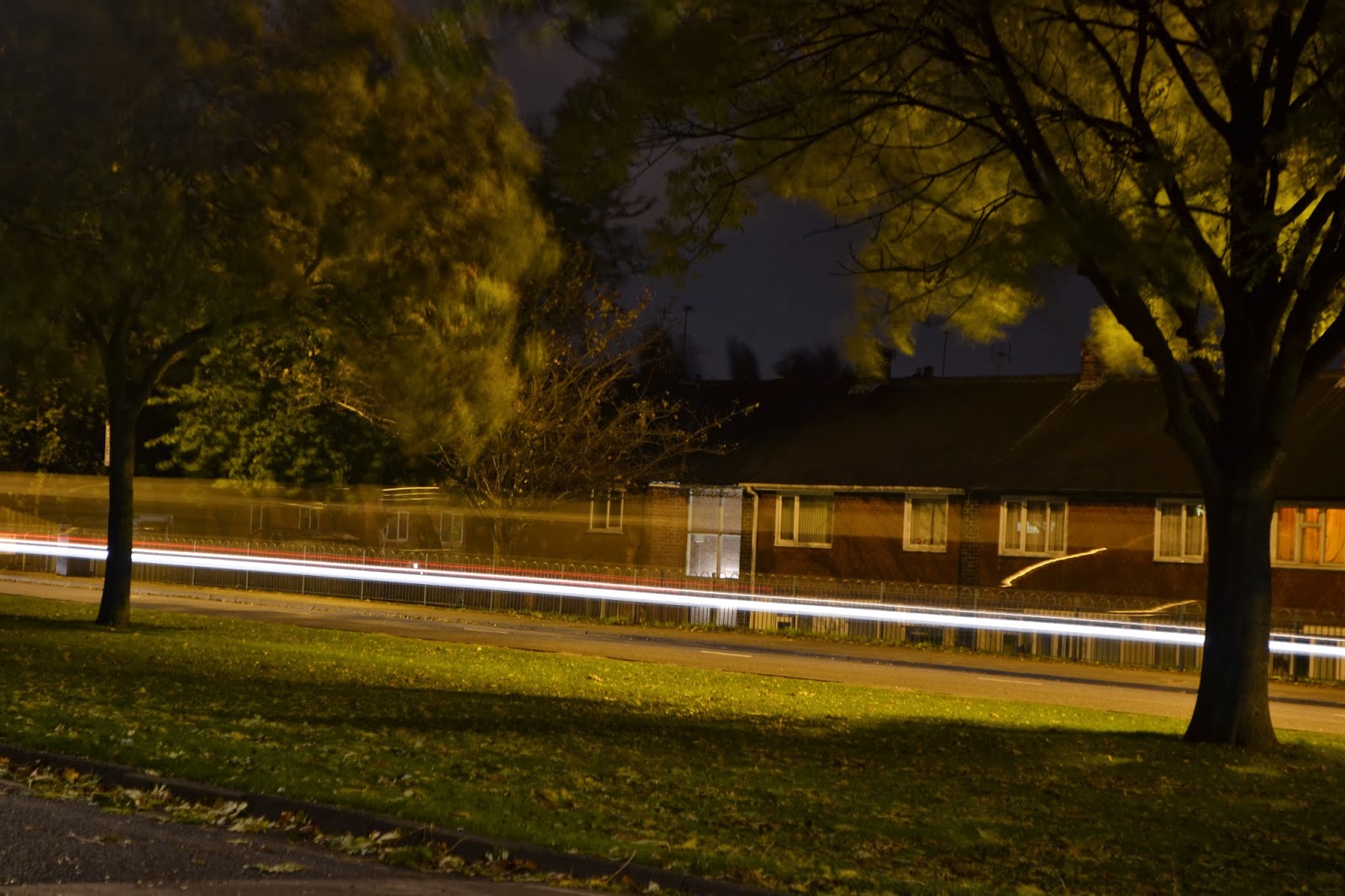 Your eye leads towards the line because it stands out from the dark background. I feel like it works as a leading line by guiding you along the image.
The techniques I used were an aperture of F/5.6 and a shutter speed of 5 sec. This was because I needed enough light to go in, but also needed it to have a slow shutter speed to create the line from the vehicles.
The colours in this image are black, yellow, green and white. The white is at a high contrast because it's brighter than the other dark colours.
I really liked how the line is cleary visible and lasted the whole length of the page because it was the main part of the picture so it had to stand out. However, I do not like the background because the trees are very distracting as they ruin the sky and hides part of the line. The leaves were very blurry as well so I still had some camera shake shown, or didn't chose the right aperture.
Also, the image looks quite yellow which I think ruins the image. I would have preferred it if it was all quite dark apart from the lights from the roads.
I only took a few photos of this theme because they weren't strong images as I had no tripod. Although, I really enjoyed the idea of slow shutter speed because I love the fact it captures movement; it gives the image a sense of character. With this in mind, I experimented with slow shutter speed more but with sparklers. Seeing as it was bonfire night it was the perfect opportunity to capture the movement of sparklers. Below is my result:
 In this image I really like the brightness of the sparklers; it really captures the eye. I like how the person in the background is there because it helps people understand that it's sparklers that have been used, and the fact they're blurry makes all the focus on the sparklers. Your eye leads to the sparklers because they're bright against the dark background. The composition is in the middle to create a symmetrical look.
The techniques used was an aperture of F/7.1 and a shutter speed of 8 sec. This is because it was dark outside so I needed a lot of light to come through, and it had to have a slow shutter speed to capture the movement.
The colours in the image are black and white, so the white is at a higher contrast because it stands out from the darkness.
I get a magical feel from this image because of the sparklers due to it reminding me of fairies or magic.I don't like how it's just a circle, I would have preffered it if the lines were all over the place to fill the whole picture. It would just give the picture move movement.
 In this second image, I really like how the sparkler fills in more of the page because you can see more movement in the image, giving the image a sense of character. However, I don't like how yellow the sparkles are because it makes the image look harsh and sharp; I would have preferred it to look soft to show the innocence of sparklers.
Your eye leads to the top right corner as that is where the most sparkles are; following the rule of three.
The techniques I used were an aperture of F/8 and a shutter speed of 6 sec. This was because it was dark outside so I needed to allow more light through, and also needed a slow shutter speed to capture the movement.
The colours in this image are black and white, although the sparkles do look a bit gold. The sparkles are at a high contrast because it stands out against the dark background.
To improve this image, I would think about the composition more to make it more interesting. I could even come up with the idea of moving the sparklers around an area to make it seem like it's moving around the world.
No comments:
Post a Comment